Added
Stacked Area Graphs
September 24th, 2024
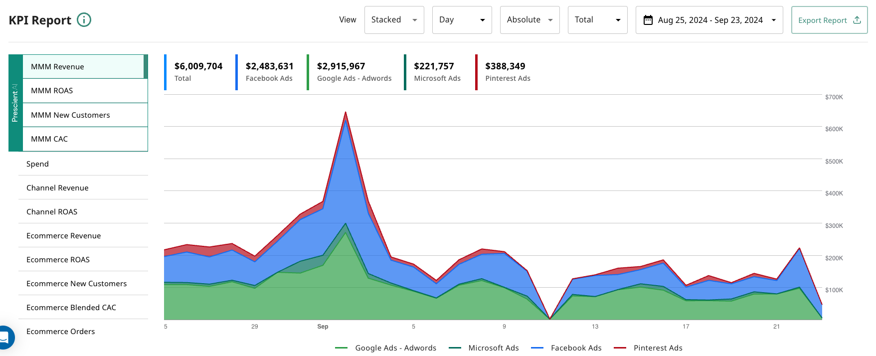
Our users asked us for a new way to visualize time series data on the KPI card on the homepage. We answered this demand by adding in the option for a Stacked Area chart, in addition to the classic line time series chart. To toggle on this feature, simply use the View As toggle, and select Stacked.
Here is a sample of the what the stacked area chart looks like: