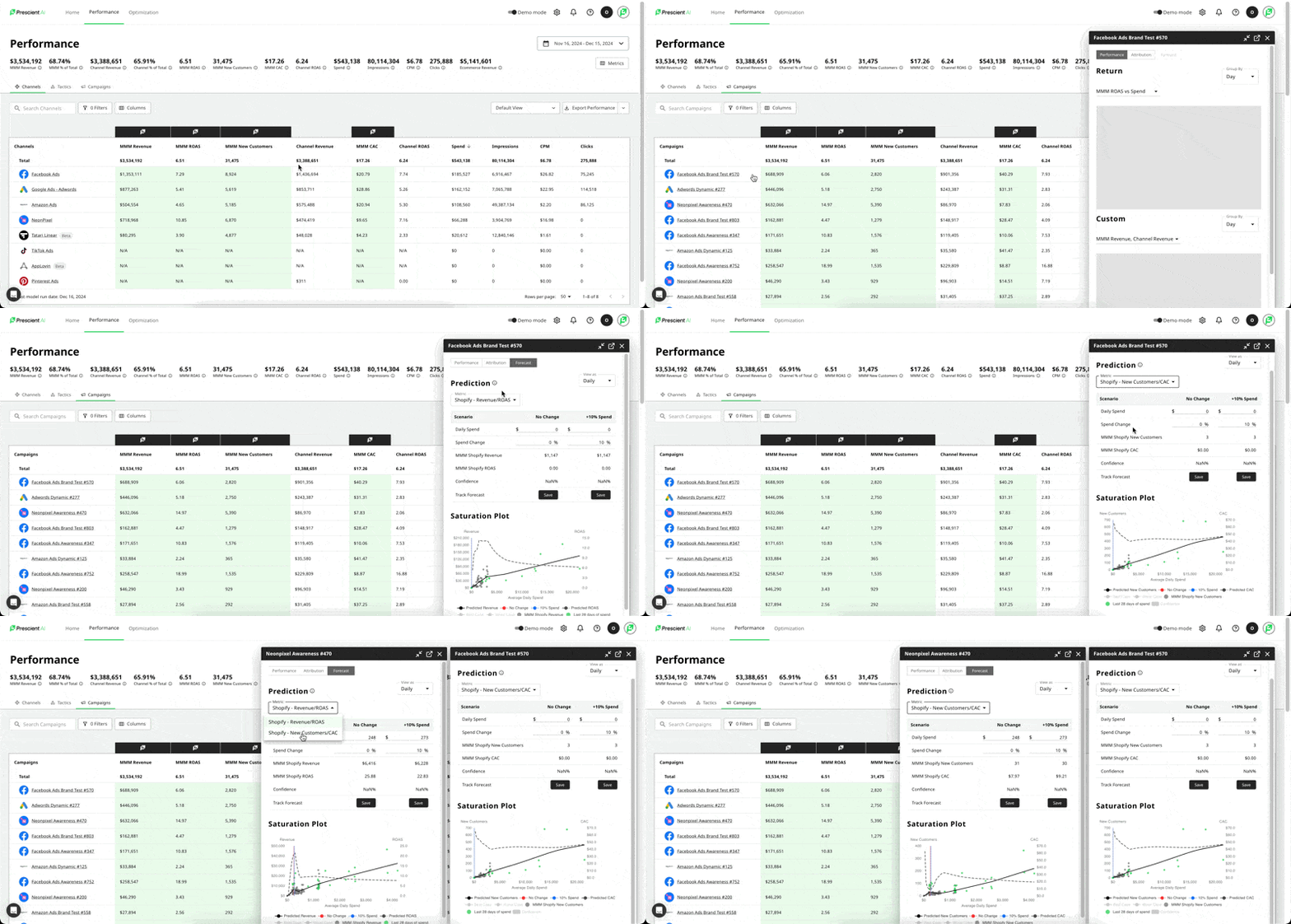
We’re making a small but meaningful change to the way we display campaign data on the Performance Dashboard.

What’s changing:

Previously, if a campaign had a day with zero spend, we excluded that day from the dashboard even if other metrics (like impressions or attributed revenue) were non-zero. With this update, we’ll now include those days in the dashboard.

What this means:

You may notice more campaigns appearing in the campaign drawer, especially for days with little or no spend.
This update allows us to more clearly show modeled attribution behavior, such as how revenue can still appear after spend has dropped to zero.

Why this matters:

This change improves transparency into our model's lagging attribution effects and aligns the dashboard more closely with how platforms actually report data. Even when spend pauses, platforms often still report impressions and revenue — and now, so will we.

Important Note:

As a result of this improvement, modeled revenue and new customer counts may shift slightly. These changes reflect a more accurate and complete view of campaign performance and attribution over time.

Homepage Layout Refresh & New "MMM %" Card

Buckle up! Your homepage got a refresh, and we think you're going to love it.

First, we've brought the Halo Effects card to the top of the screen. Halo Effects validate your top of funnel marketing budget and give you a quick sneak peak at which channels are driving the best awareness, and which are driving the most conversion, across all your web stores! Check out more about the new Halo Effect card below

Your home page is getting a new card called "MMM %" as well. Let's dive in there.


Understanding the legend

each key can apply to Revenue or New Customers depending on the user selection at the top of the chart — defaulting to Revenue:
​NOTE -- "DTC" below will refer to whichever primary ecommerce web store data you are using, e.g. Shopify, BigCommerce, GA4, etc.​

  • Total Modeled: this is the % or absolute # of Revenue or New Customers that our models say were driven by your paid media efforts compared to the total number across all your stores (e.g. DTC + Amazon)
    ​In the example above you'll see that between Nov - Dec, we modeled that 90.4% of this brand'sTotal Revenue was driven by their paid media.
  • DTC/ Amazon Selling Partner: this tells you the % of revenue or new customers observed on the named web store (e.g. Shopify, Amazon) that came from media.
    ​In the example above you'll see that between Nov - Dec, we modeled that 77.6% of this brand'sShopify Revenue and 12.8% of Amazon Revenue was driven by their paid media.​Note that:
    • "DTC + Amazon Selling Partner" = "Total Modeled Revenue"
    • 12.8% (Amazon) + 77.6% (Shopify) = 90.4% (Total Revenue) in this case.
  • Non-MediaDTC / Amazon: This explains revenue that was either non-measured through the Prescient model, or can otherwise be considered "word of mouth" attribution. Mathematically it is the difference between what was driving by media to your Shopify and what is not.
    ​ ​Note that:
    • "Non-Media DTC + Non-Media Amazon" = "100% - Total Modeled Revenue"
    • Example above:
      ​0.68% (Non-Media Shopify) + 8.92% (Non-Media Amazon) = 9.6% ​100% - 90.4%(total modeled) = 9.6%

How to derive value from this chart

Users should use this card to quickly understand where their media is driving the most value. High areas of non-media revenue (or new customers) are a sign that there was some other activity driving your conversions. These can include but are not limited to the following:

  • On site promotions
  • New product launches
  • Brand specific events/holidays
  • Offline media activations not measured on Prescient (e.g. morning news spotlight)
  • Word of mouth sales

Now, you can navigate the home page card to understand the various cuts that your Halo Effects might take.

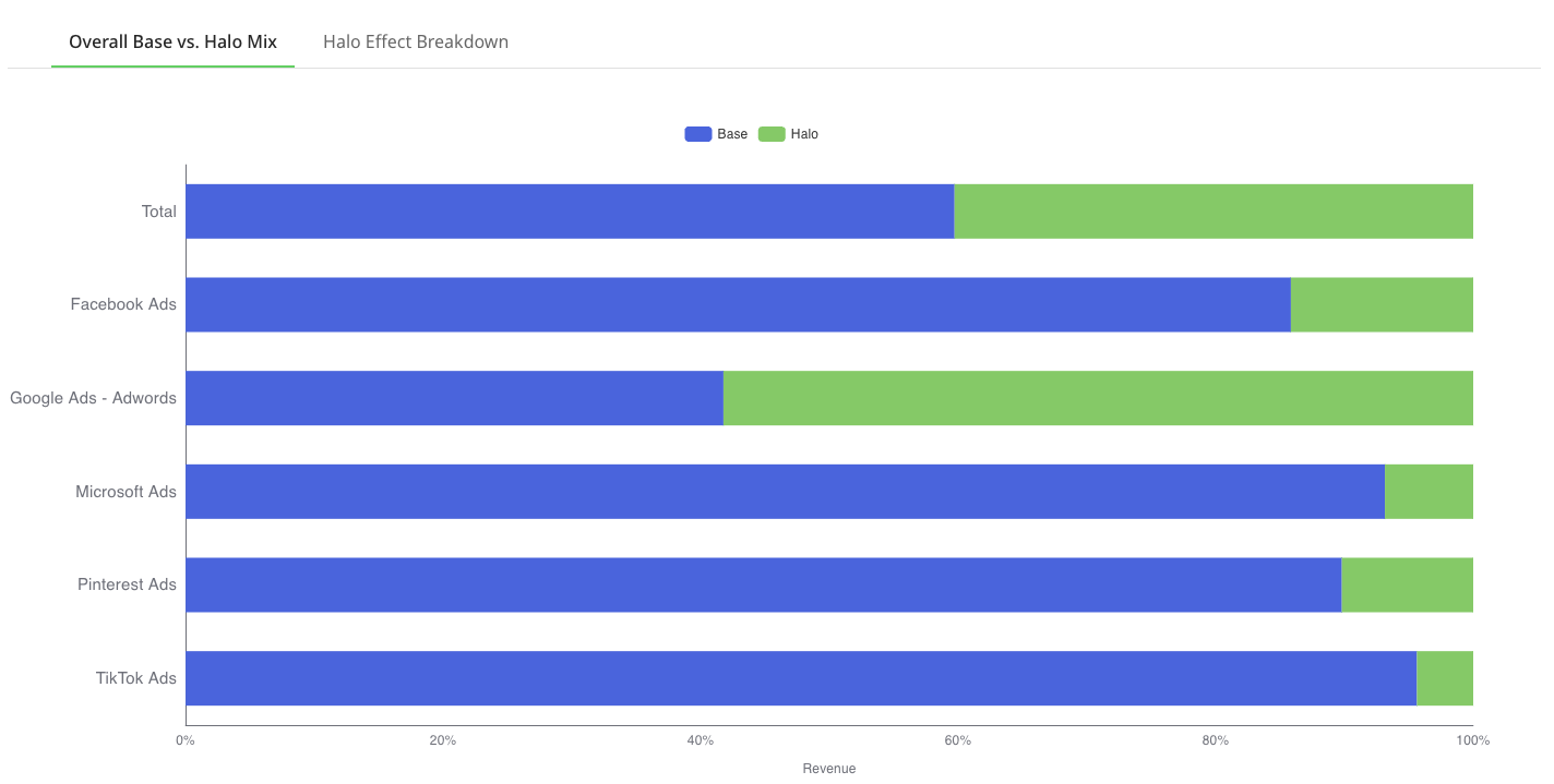
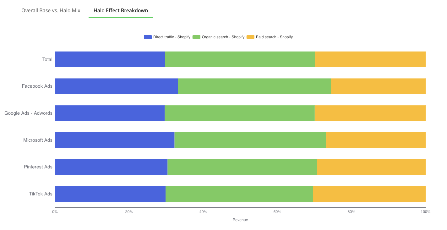
For customers that only have a single store (e.g. Shopify, BigCommerce, etc), your Halo Effect cards will have 2 tabs:

  • Overall Base vs Halo Mix: which will show you the breakdown of base vs halo for each channel in your marketing mix.

  • Halo Effect Breakdown: looks at ONLY revenue from your halo effects per channel, and explains where those channels are driving the most traffic (direct sessions, paid search, or organic search/SEO).


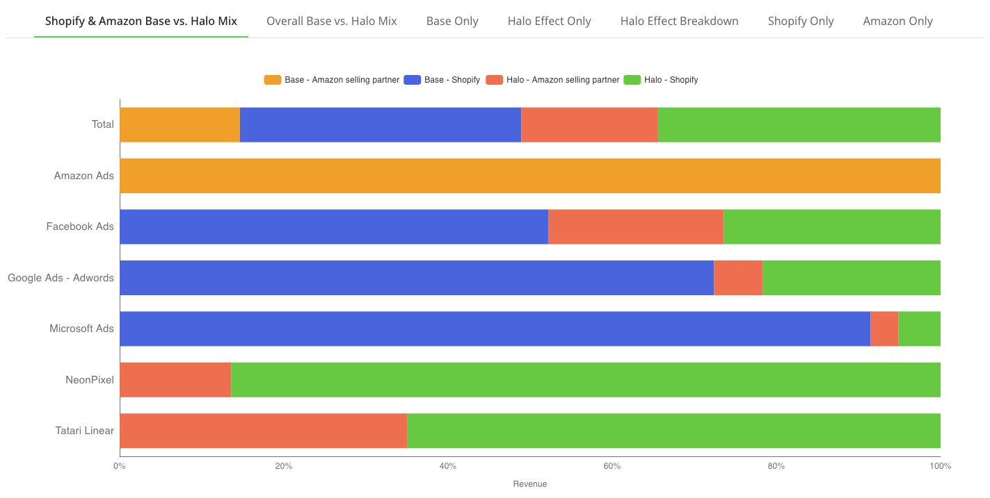
For customers who have multiple storefronts (e.g. Shopify + Amazon), you'll be able to see the cuts of Base and Halo effects for a number of different cuts fo the data.

  • Shopify & Amazon Base vs Halo Mix: shows you the distribution of base and halo effect value per channel across EACH store front.

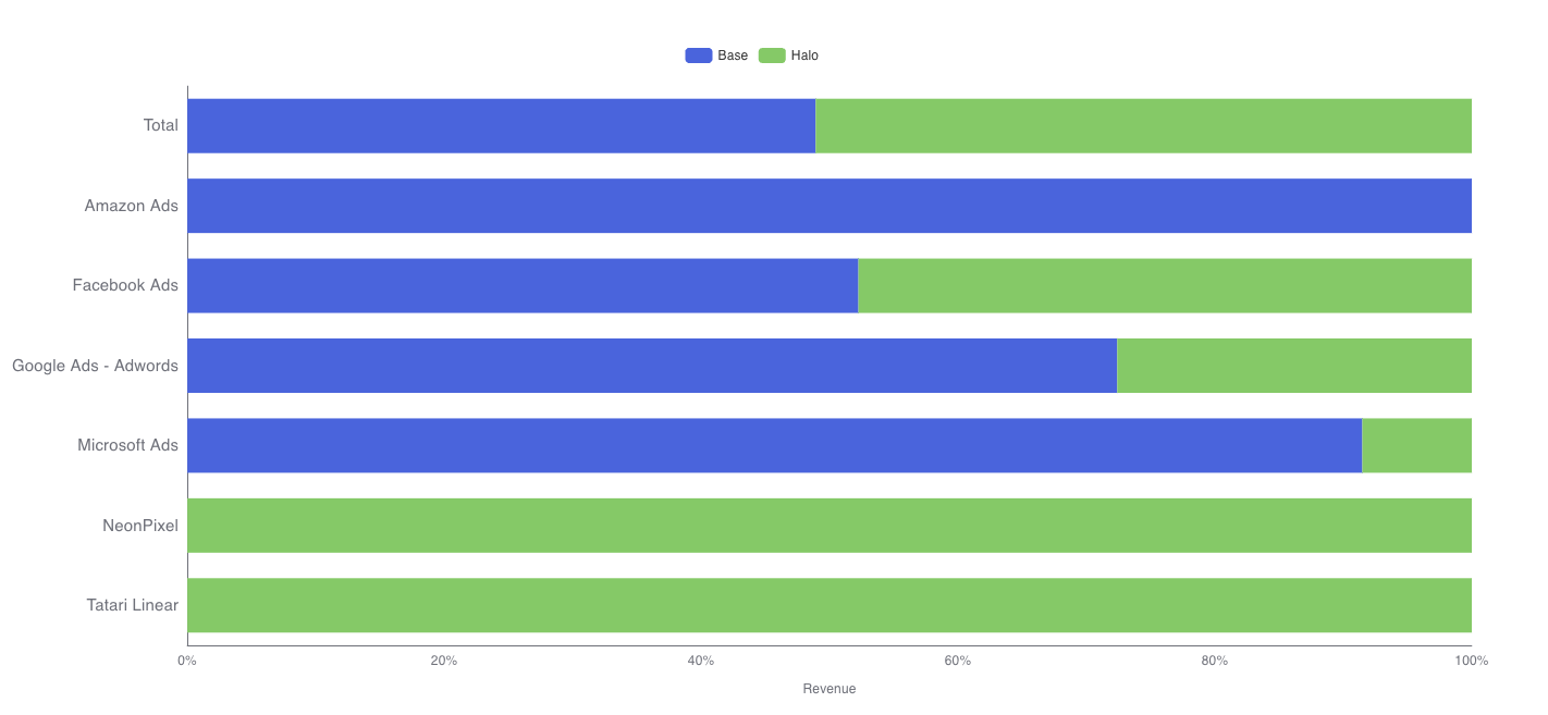
  • Overall Base vs Halo Mix: shows you the distribution of base and halo effect value per channel summed across BOTH store fronts. This helps you to understand more about which channels lean higher or lower in the funnel in terms of performance (below shows that Google and Bing are effective lower funnel channels, Facebook is driving both awareness AND conversions, and CTV channels are purely top of funnel plays)

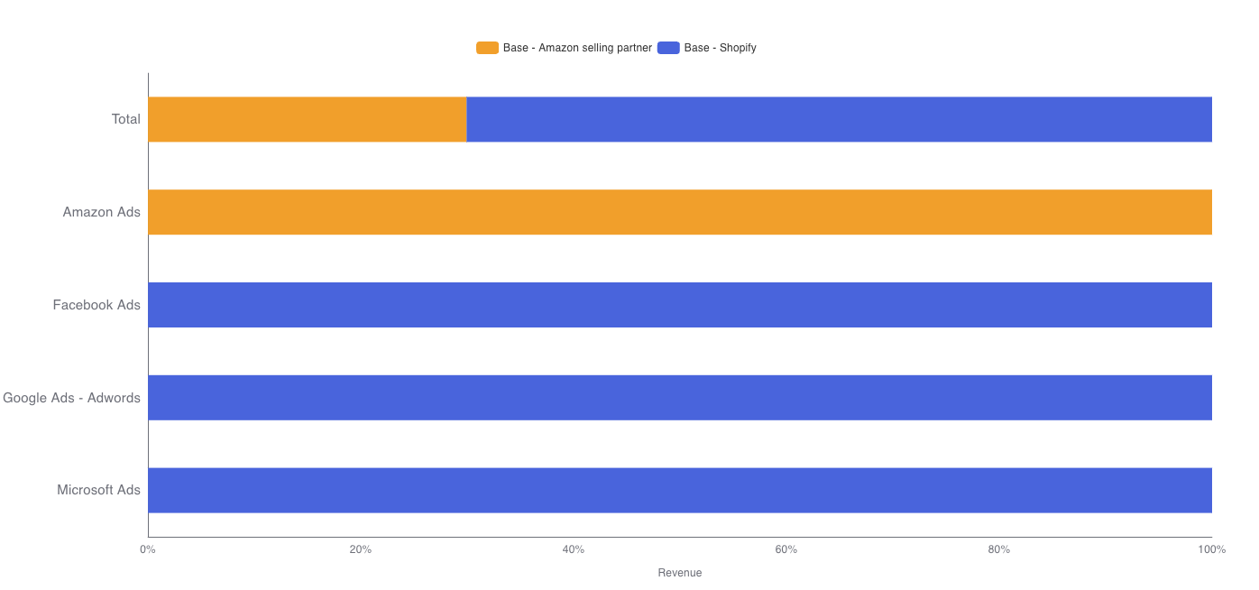
  • Base Only: tells you the split of BASE revenue across your store fronts

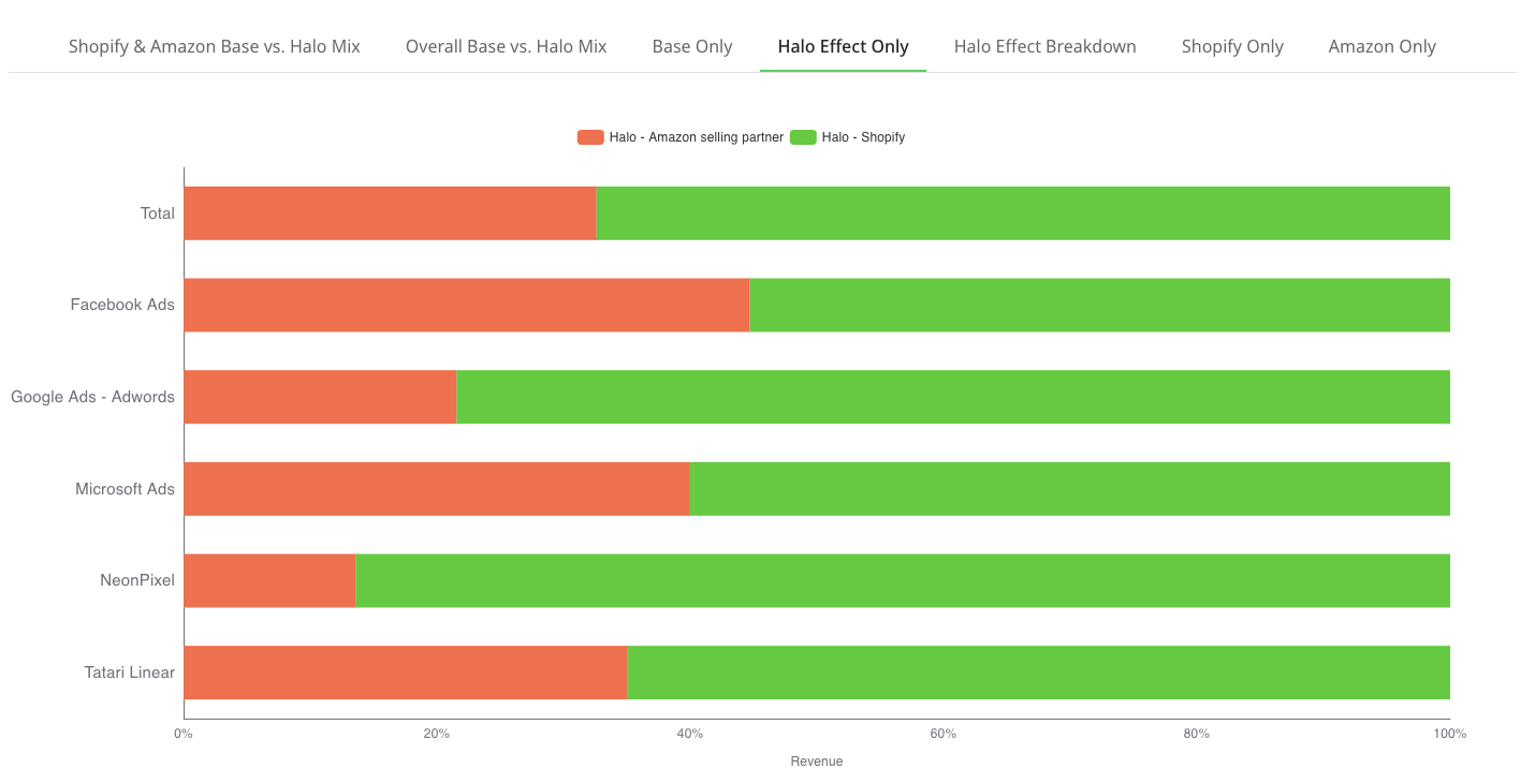
  • Halo Effect Only: tells you the split of how each channel is driving halo effects across both store fronts

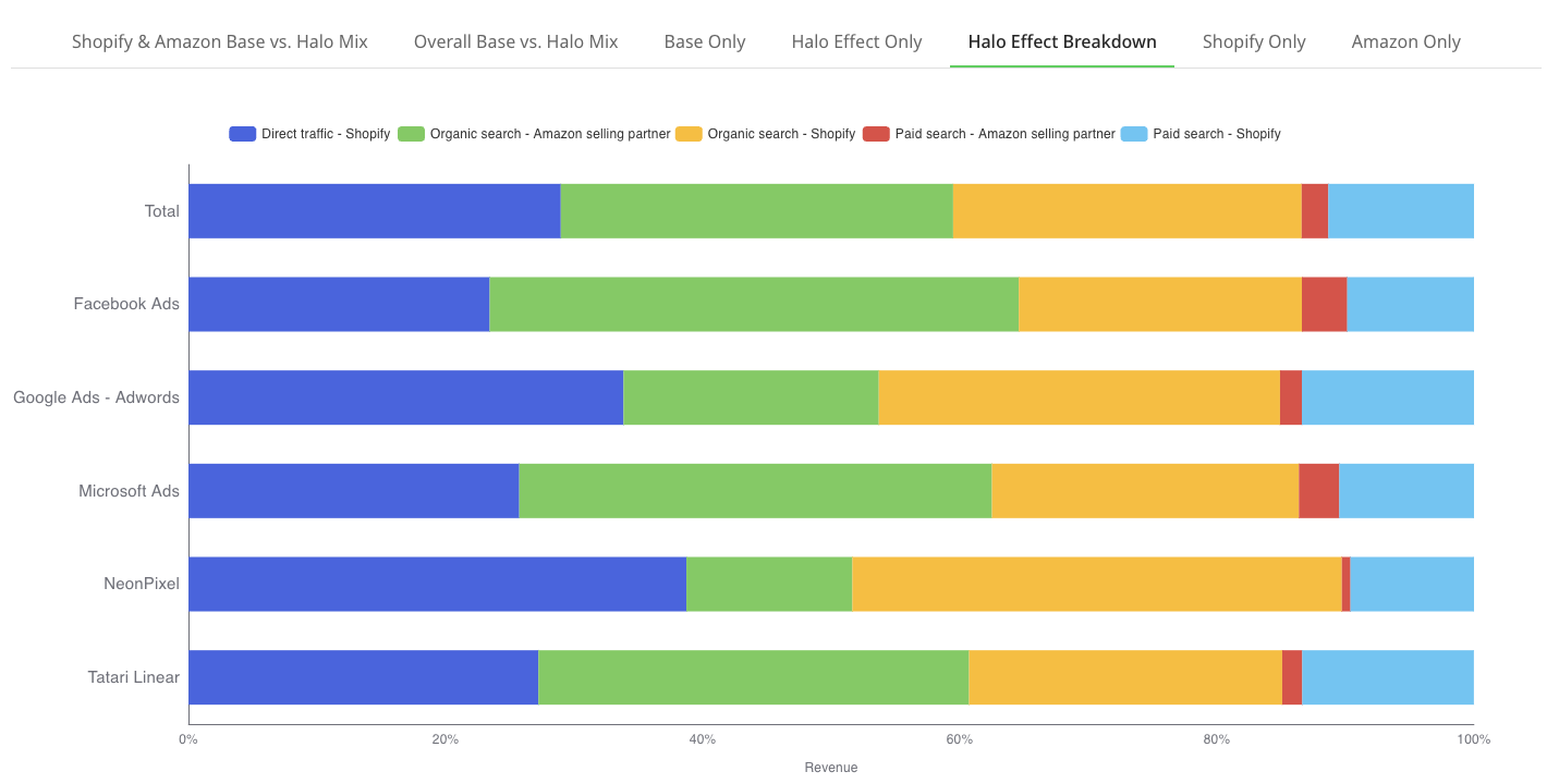
  • Halo Effect Breakdown: looks at ONLY revenue from your halo effects per channel, and explains where those channels are driving the most traffic (direct sessions, paid search, or organic search/SEO) AND to which store front.

  • Shopify Only: isolates channel base vs halo mix to just revenue on your primary store front (note: this tab will be named respective to the ecommerce platform you use)

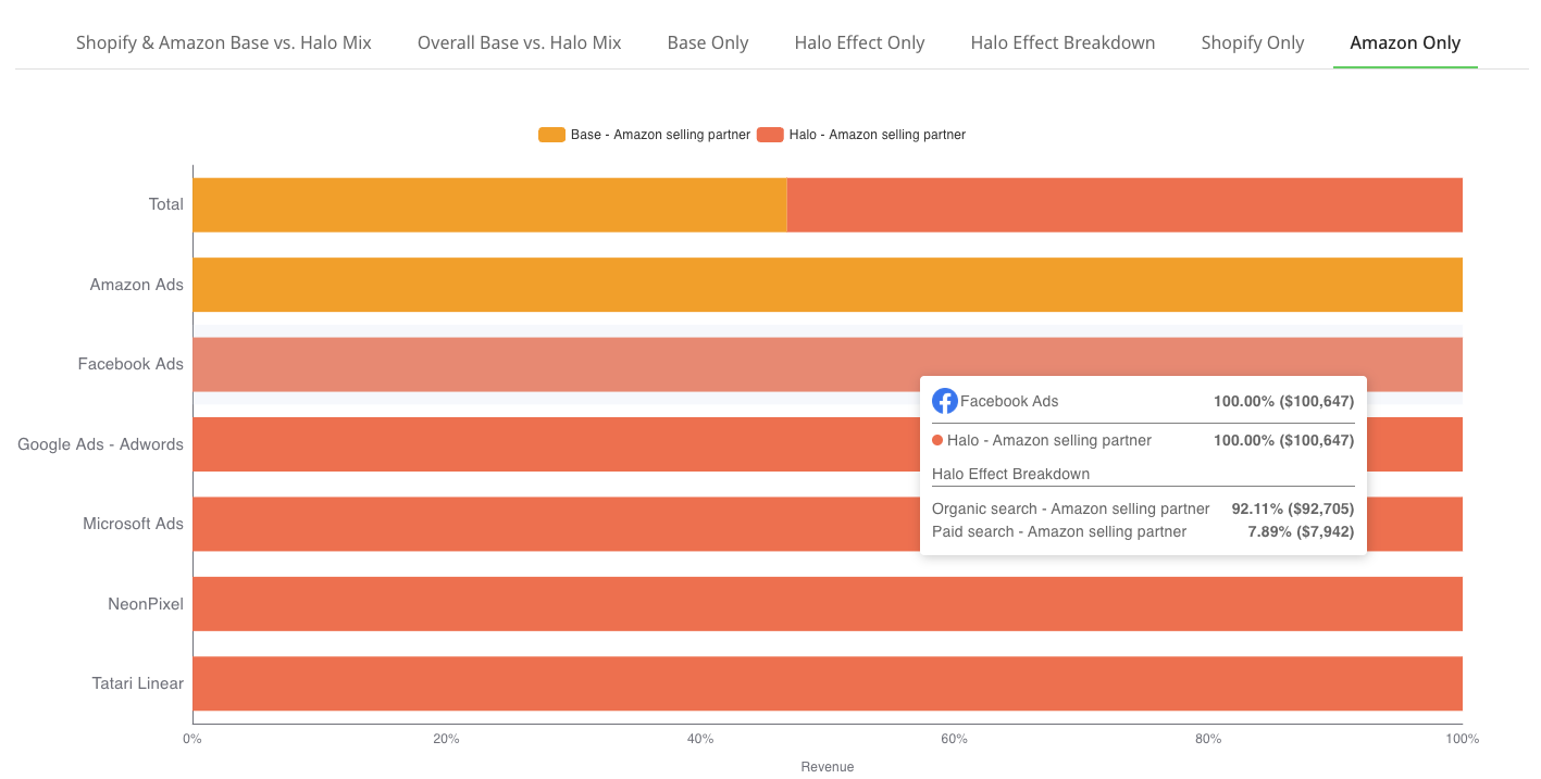
  • Amazon Only: tells you the breakdown per channel for how much base and halo is being driven to your Amazon store. Remember you can always hover over the bars to see the dollar value and how much the halo effects are split by value.

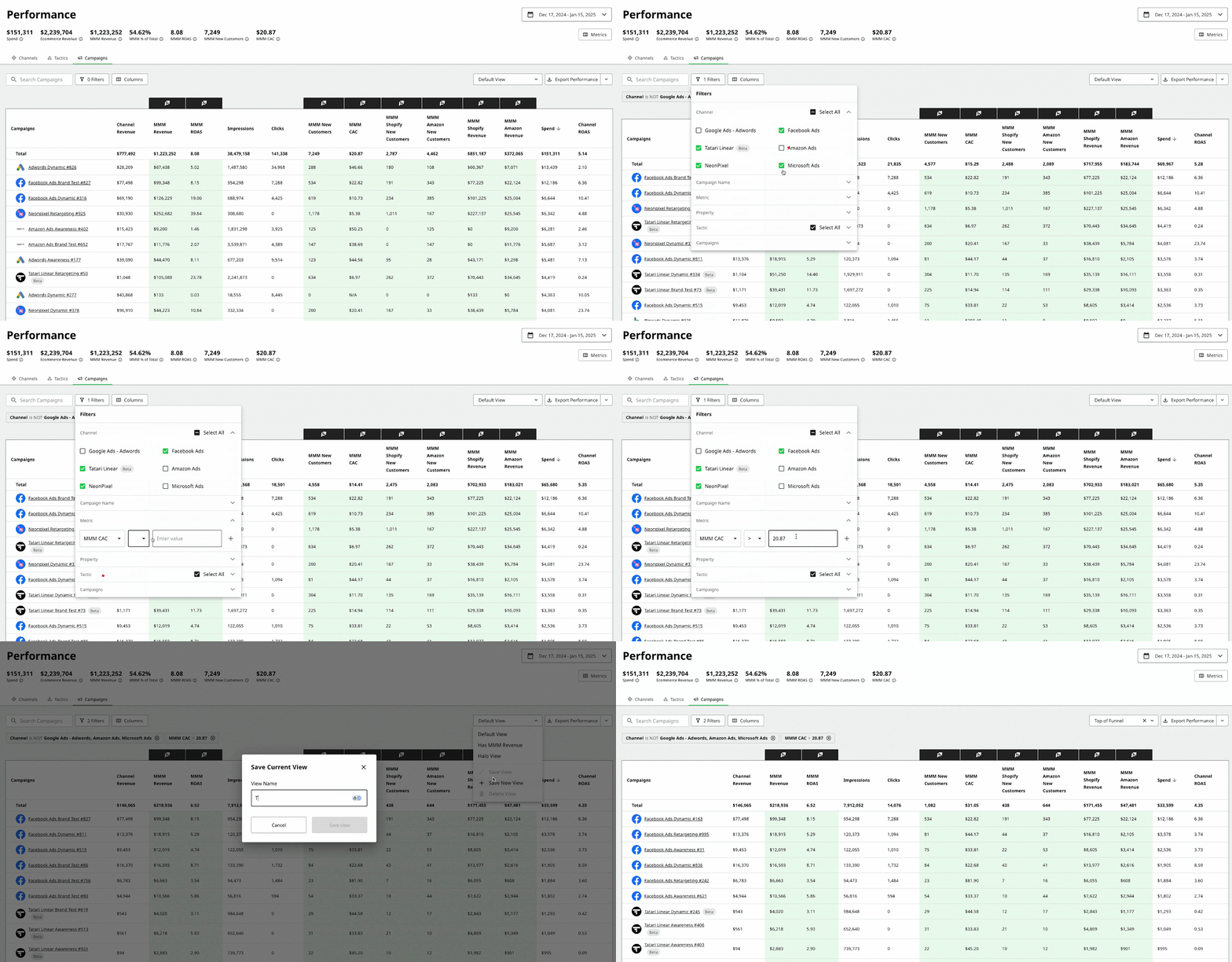
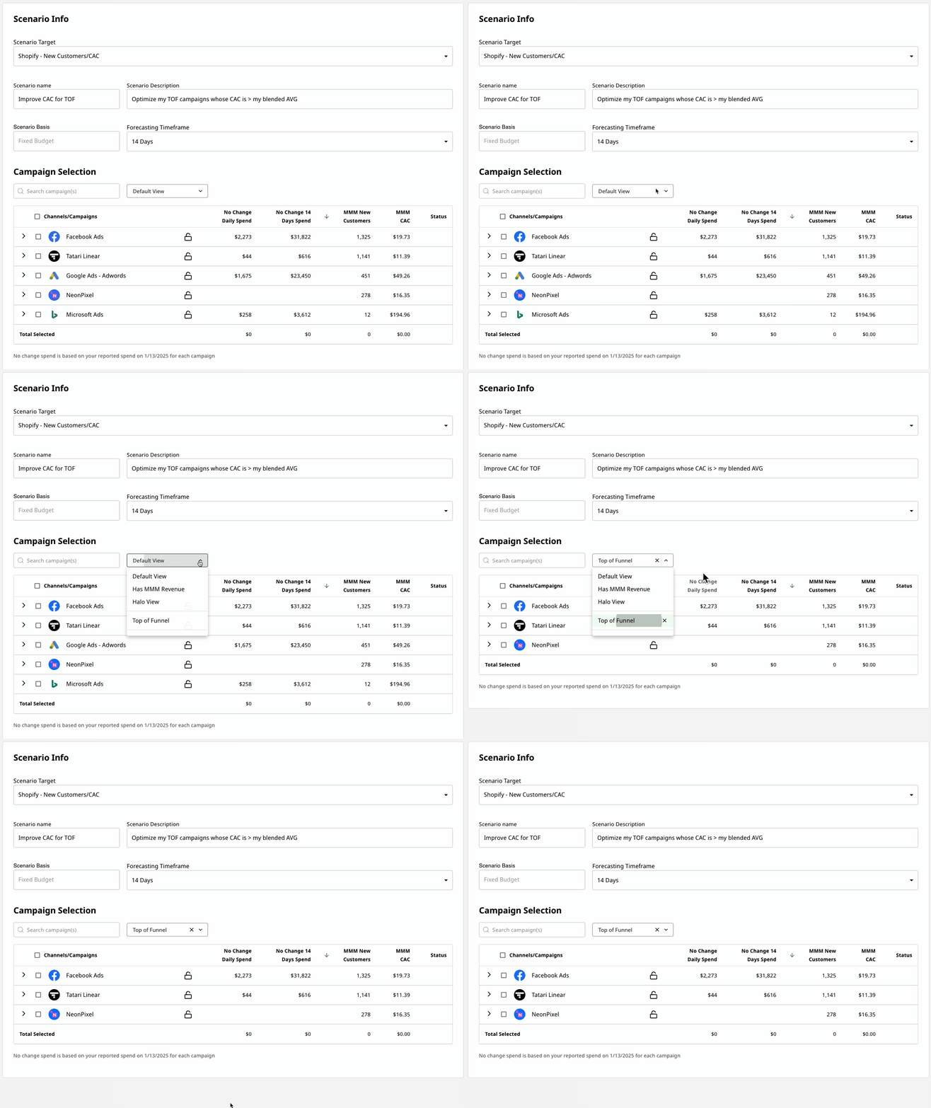
Recall the “Saved Views” function from the performance page? We’re bringing them to the Optimization Creation screen as well so that you can easily filter your campaign choices when creating optimizations!

Step 1: Create a saved view on the Performance Page

Example — "top of funnel campaigns from Facebook, Tatari, or Neon Pixel that have an above average CAC"

Step 2: Create an optimization and use the saved views field under Campaign Selection

Example — Maximize new customers from top of funnel campaigns with an above average CAC

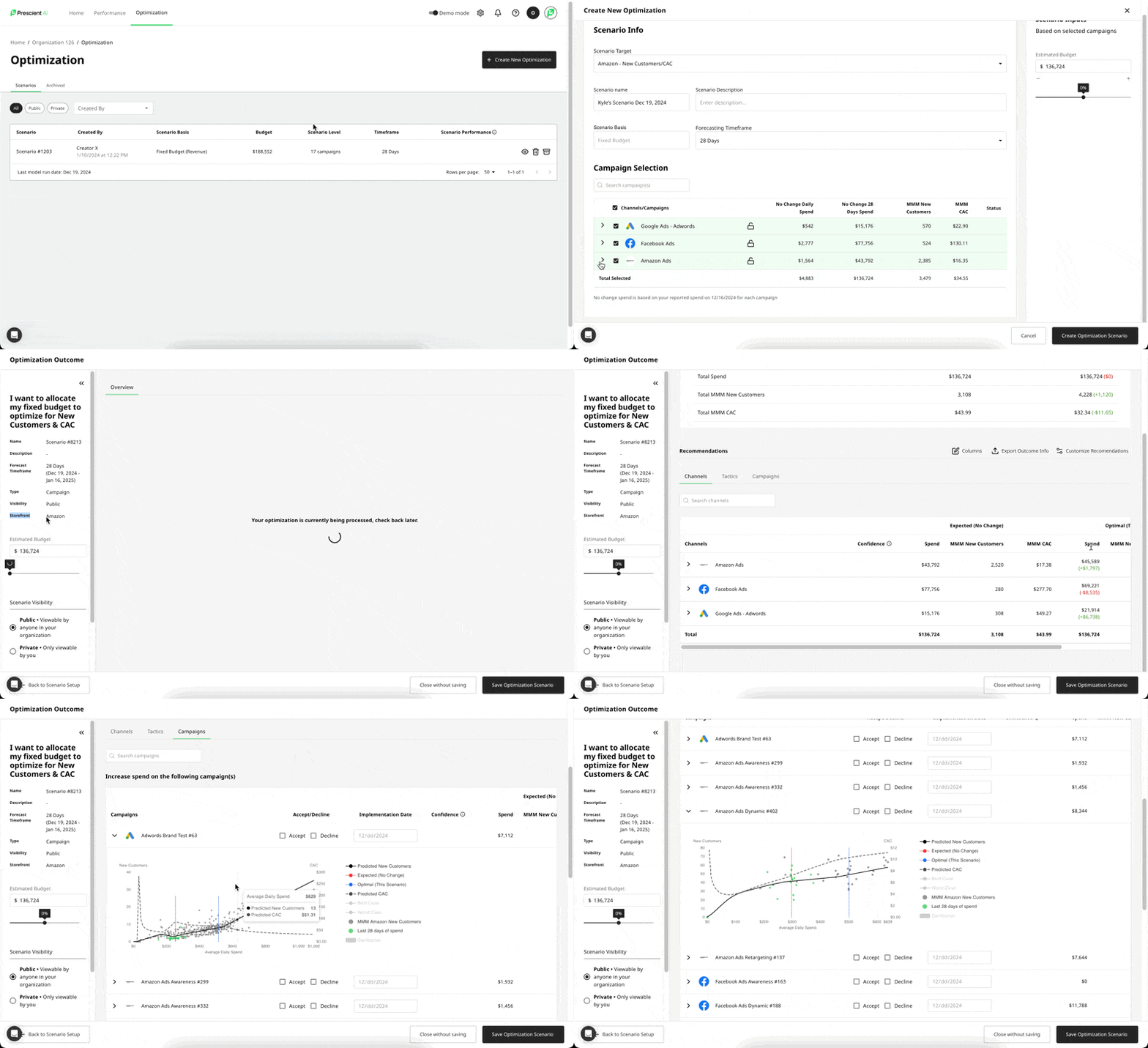
This release introduces a novel addition to our optimizer toolkit: Amazon focused optimization. You can now choose to optimize your campaigns for one of four options: Revenue/ROAS for your primary storefront (e.g., Shopify), New Customers/CAC for your primary storefront, Revenue/ROAS for your Amazon storefront, or New Customers/CAC for your Amazon storefront. This release allows you to tailor ad spend for each campaign to align with your specific goals across all connected eCommerce stores. With this update, you’ll have the detailed insights needed to make informed decisions and allocate your budget effectively, maximizing the potential of each storefront.

Key Updates at a Glance

Optimization Update: Amazon Revenue & New Customer Optimization

  • Two new options are now available when selecting a scenario target for optimization: Amazon Revenue/ROAS and Amazon New Customers/CAC.
  • After selecting a scenario target, the campaign selection menu updates to display historical performance details at both the campaign and channel levels for your selected target. For example, if you select Amazon Revenue/ROAS as your scenario target, the campaign selection table will show model-attributed revenue and ROAS for your Amazon Ads campaigns, as well as halo effect revenue driven to Amazon from all other channels.
  • From there, the optimization flow mirrors the process of creating an optimization for your primary storefront. After selecting campaigns and running the optimization, you will see:
    • Impact Overview: The expected effect of the optimized spend recommendations on your selected scenario target. The storefront and metric targeted for optimization are always displayed on the details panel on the left-hand side of the optimization outcome screen.
    • Spend Recommendations: Detailed recommendations on how much to allocate to each campaign over the forecasted timeframe, the impact those recommendations will have on your selected scenario target, and the corresponding performance metrics (i.e. ROAS or CAC depending on your target).
    • Saturation Curves: Visualizations for each optimized campaign, illustrating how your selected scenario target changes as you increase or decrease spend.

Performance Page Enhancements: Amazon Saturation Curves

  • Forecasting tabs are now enabled within the drawers on the performance page for Amazon Ads campaigns. These tabs include a dropdown menu that allows you to toggle between Revenue/ROAS and New Customers/CAC views for Amazon campaigns.
  • Two additional options: Amazon Revenue/ROAS and Amazon New Customers/CAC - are now available in the metric dropdown on the forecasting tab for non-Amazon ad channels. These options display saturation curves for the halo effect revenue or new customers that these campaigns drive to Amazon.

Video Walkthrough

This update requires that you have Amazon revenue data connected to your Prescient account and is limited to optimizing campaigns that are included in MMM modeling. Additionally, when optimizing for revenue or new customers on your primary storefront (e.g., Shopify), the spend allocation will not account for halo effects driven to Amazon. To capture and optimize those halo effects, you’ll need to optimize directly for Amazon revenue or new customers.

We’re eager to see how you utilize this update to drive meaningful growth on Amazon. As always, your feedback and questions are invaluable to us - don’t hesitate to reach out to our team to learn more or share your thoughts.

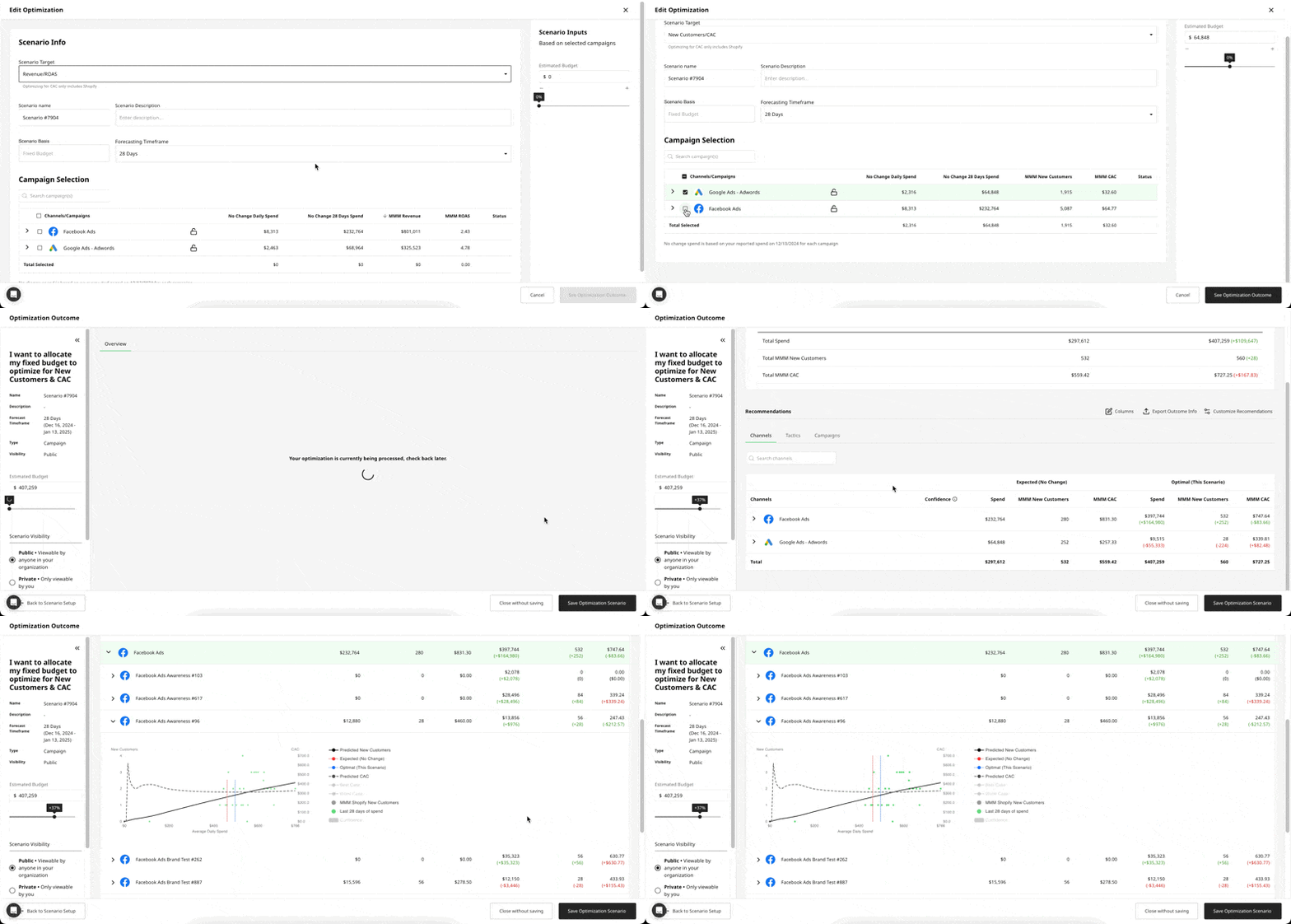
This week, we’re excited to release a significant enhancement to our optimization toolkit: CAC Optimization. With this update, you can now choose to optimize your ad spend for either overall revenue or new customer acquisition, empowering you to make more strategic decisions at every stage of your marketing funnel. Whether you’re focusing on maximizing new customer acquisition across all channels or selectively optimizing specific campaigns for CAC instead of ROAS, this update gives you greater control over how your budget is allocated to meet your goals.

Key Updates at a Glance

Optimization Update: CAC Optimization

  • A new option, Scenario Target, is now available when creating an optimization scenario. You can choose between Revenue/ROAS or New Customers/CAC as your focus.
  • Upon selecting New Customers/CAC as your scenario target, the campaign selection menu updates to display spend and MMM New Customer/CAC attribution details at both the channel and campaign levels.
  • From there, the optimization flow mirrors the familiar Revenue/ROAS process and includes all the features you’re accustomed to. After running the optimization, you will see:
    • Impact Overview: The expected effect of the optimized spend recommendations on your MMM New Customers and CAC, both overall and at the channel/campaign level.
    • Spend Recommendations: Exact recommendations on how much to allocate to each campaign over the forecasted timeframe, the number of new customers that spend is expected to drive, and the corresponding CAC for those new customers.
    • Saturation Curves: Visualizations for each optimized campaign, showing how MMM New Customers and CAC shift with increases or decreases in spend.

Performance Page Enhancements: CAC Saturation Curves

  • The Forecasting Tab within the performance page drawers now includes an additional dropdown, allowing you to toggle between Revenue/ROAS and New Customers/CAC views.
  • New Customer/CAC saturation curves can be used similarly to Revenue/ROAS saturation curves, offering insights into the relationship between spend on a given campaign and the number of attributed new customers it generates.

Video Walkthrough

It’s important to note that this update applies only to revenue driven by your primary storefront (e.g., Shopify, SFCC, etc.). The optimization and generated curves do not include halo effects attributed to Amazon from your campaigns and are currently available only to organizations receiving CAC modeling. In the coming months, we will release new tools designed to optimize your spend for Amazon Revenue and New Customers. If you’re interested in helping us test these upcoming features, we encourage you to reach out.

We’re eager to hear your feedback! If you have any thoughts, questions, or suggestions, please don’t hesitate to share them with us.

During onboarding to Prescient AI, new customers will encounter an automated experience in which to QA their onboarded data before it goes into modeling. Internally, we call this onboarding state "Data QA" and we made some enhancements to the experience for our Customer Success team to better serve our customers.

  1. We made the page available to our super admins (the customer success team included) so that they can always view the metrics that are accepted or declined.
  2. We included the user who accepted or declined the metrics with date stamps
  3. We included an expanded view of granular monthly data, so that super admins could assist clients in figuring out discrepant metrics and why.

Users asked for the ability to see the KPI charts, Attribution details, and Saturation plots that are available in the campaign drawers in a wider experience so that they could explore and dig into the data with more clarity.

Users now have the ability to include a date range in the custom saved views that they create. For example, one can use a preset such as the Last 14 days vs LY as a custom view, so that it's always available to them to pull up when needed for analysis. Additionally users can select an explicit date range, such as BF/CM period and save that for future reference.