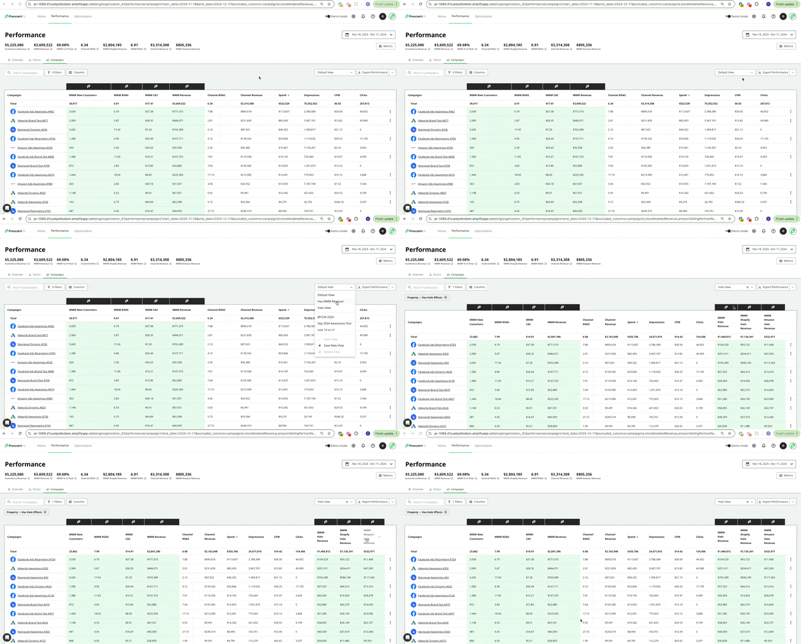
On the Performance Page, when you select Halo View from the views dropdown, this saved view will now automatically populate the Halo Effects columns split out by Amazon & Shopify.

On the Performance Page, when you select Halo View from the views dropdown, this saved view will now automatically populate the Halo Effects columns split out by Amazon & Shopify.

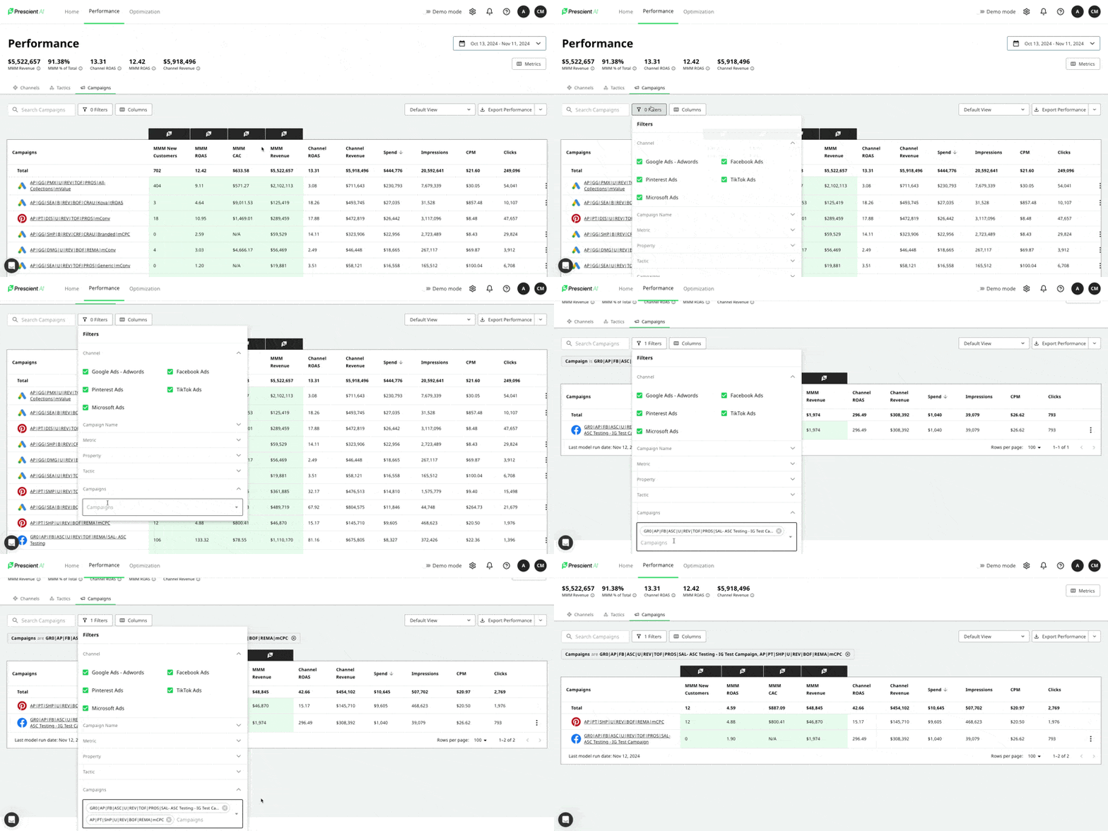
Users asked us for the ability to explicitly select individual campaigns they wish to appear on the Performance Page, and then save it as a view. In the Filters dropdown, the last option selection is Campaigns, where users can select the campaigns to filter for and see in view.

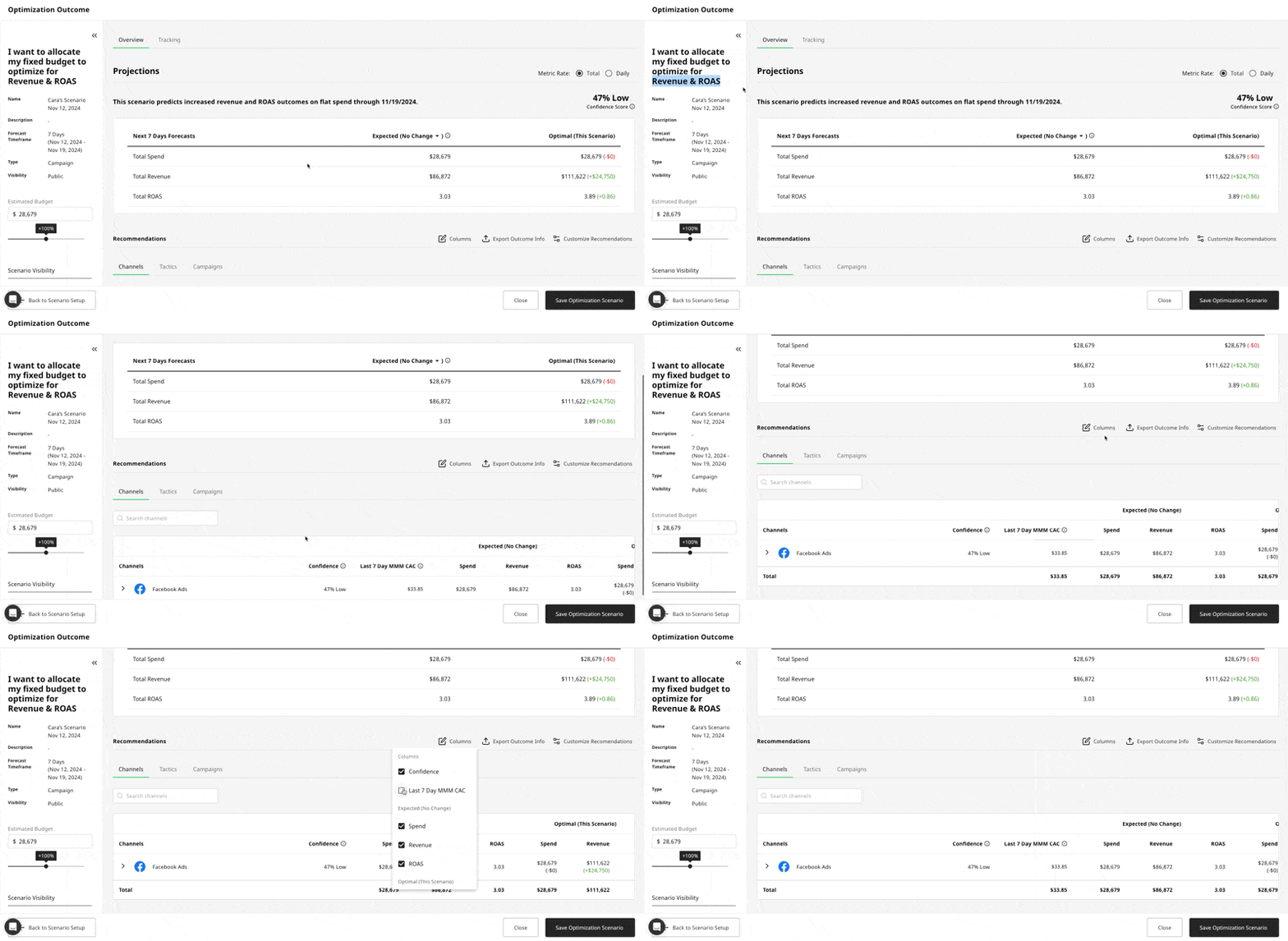
Users asked us for the ability to see the reported CAC from the prior period to use in making decisions on whether or not to accept or reject ROAS recommendations from the optimizer. Users want the ability to balance out and evaluate spend changes based on tradeoffs between ROAS and CAC. This is an optional column field that will display on the Revenue/ROAS based outcomes.

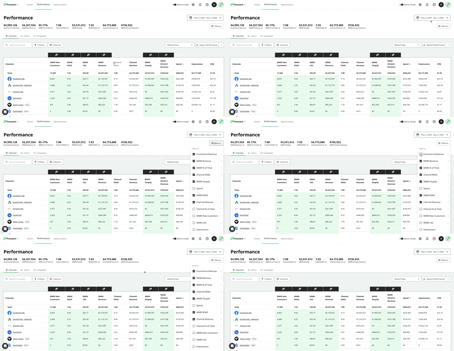
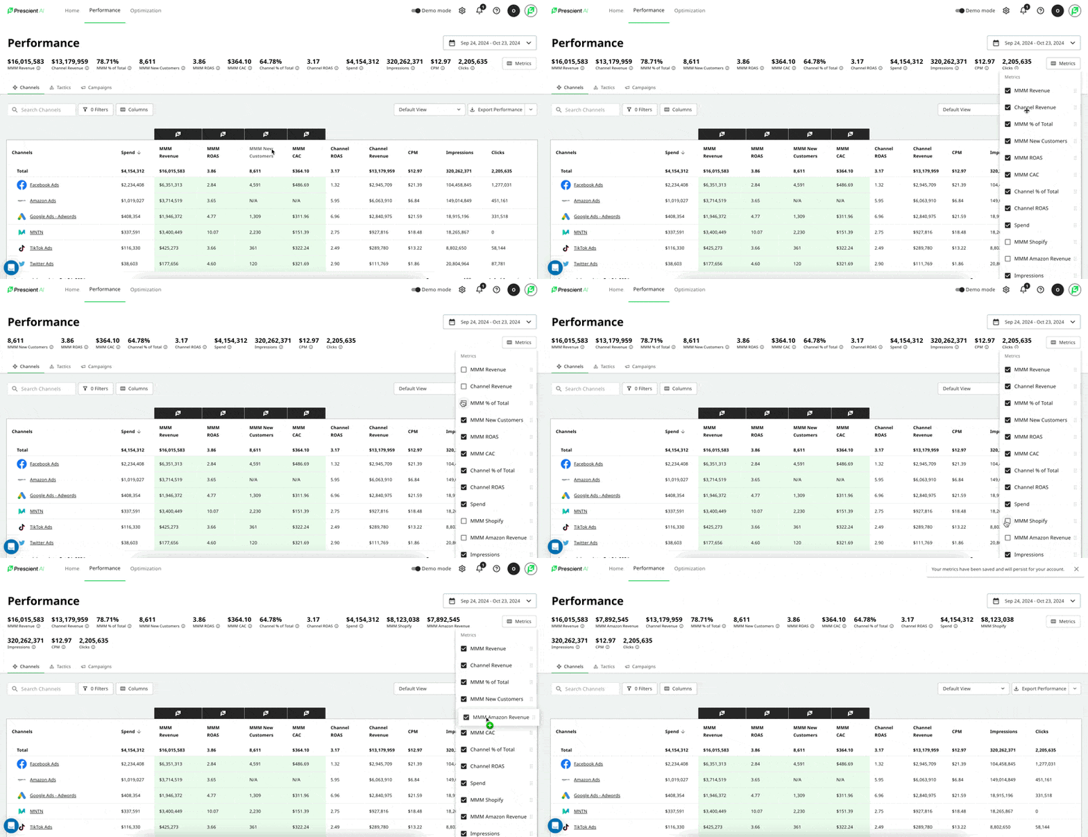
Users asked us for the ability to control which metrics appear on the hero bar on the performance page, and the order in which they appear. For this, we have released a new button called Metrics on the hero bar that allows users to configure which metrics appear and in what order. Users can control the hero bar separately from the columns which appear on the performance page. Both configurations persist for user level across any orgs that pertain to them.

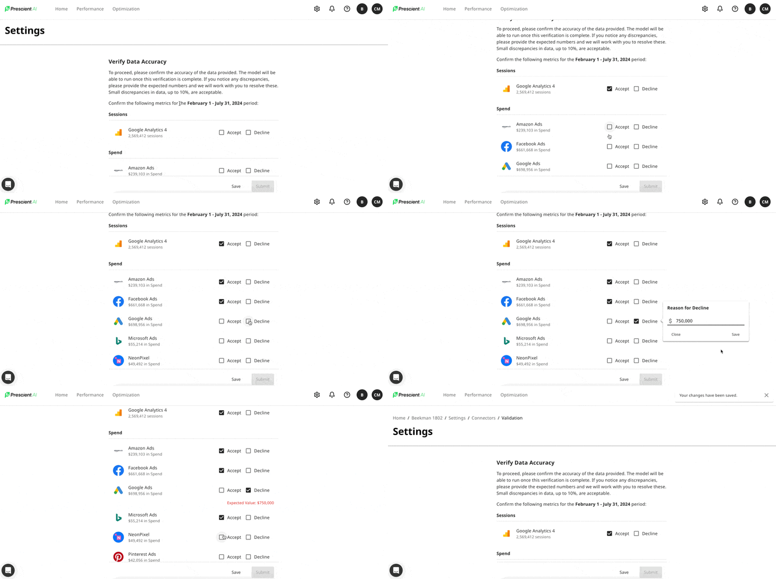
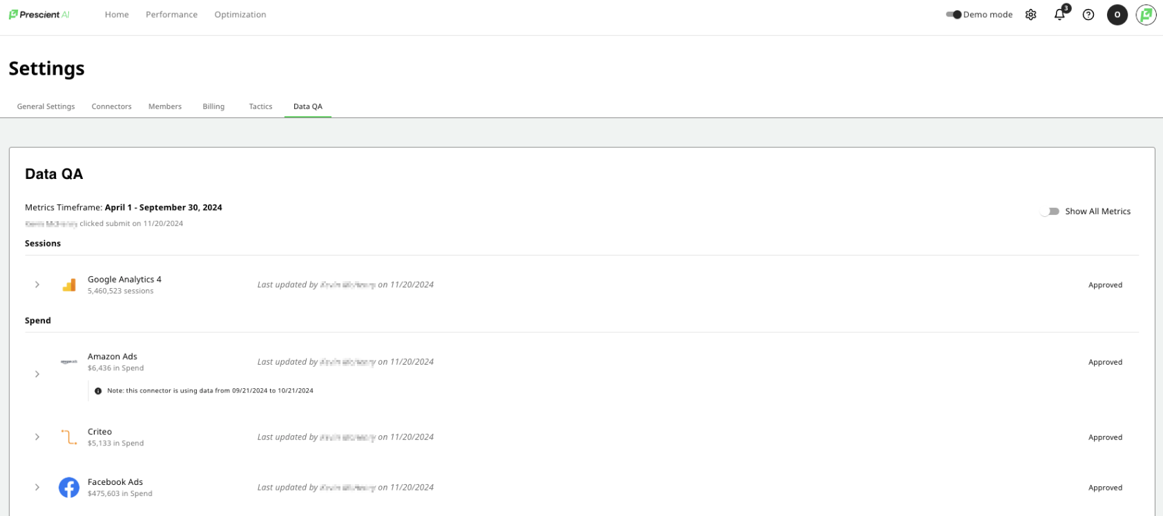
We are enabling users to ensure the accuracy of their synced data to our platform, before the data is used for modeling. Newly onboarded customers will see this brand new and automated experience.

We wanted to improve the experience of our optimization recommendations and tracking the impact of spend changes to a flow that more closely resembles how our users interact with decisions in real life. After talking to many of our users and hearing their feedback, we are really thrilled to announce this new and improved user flow which should greatly enhance and simplify the experience on platform.
Let me walk you through the experience step by step:
Create a Scenario: Select any combination of Channels or Campaigns, give the Optimizer a fixed budget on which to optimize the allocation for max Revenue and ROAS. The scenario outcome screen will appear with both channel level and campaign level recommendations, and you'll notice two new columns have been added to the results: Accept/Reject reasoning:
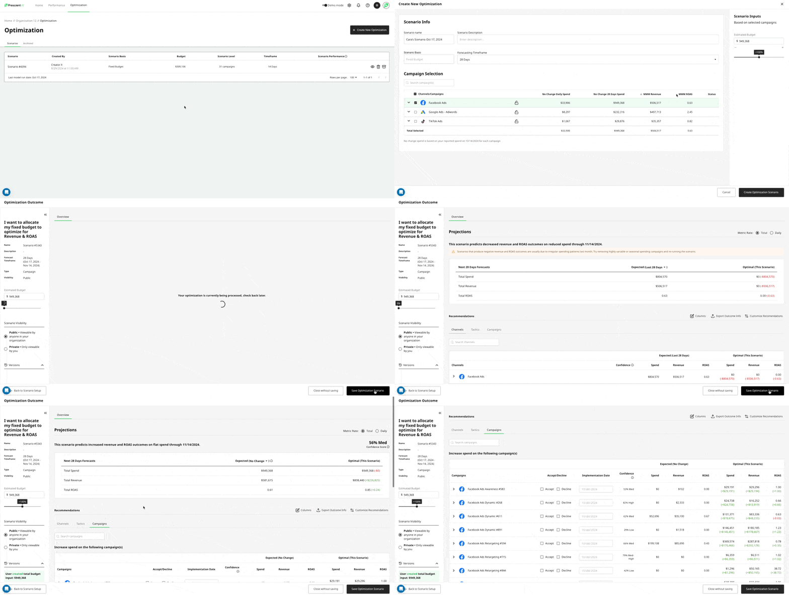
Decide with Accept / Decline: We know from user interviews and feedback that users are exploring options and sometimes cherry pick only a subset of campaigns on which to take action.
Therefore, we have added the ability to make a decision by accepting a recommendation, and also tell us when you plan to implement it - meaning when you plan to actually make the spend change live in the ad platform.
Conversely, we have also added the ability to explicitly decline a recommendation. From our user interviews, this will be helpful for cross functional collaboration among our brand, agency, and channel manager teams letting each other know which recommendations make the most sense for their line of business. Users can also pick a reason on why they are declining the recommendation so that it persists and they can remember the reason in the future.
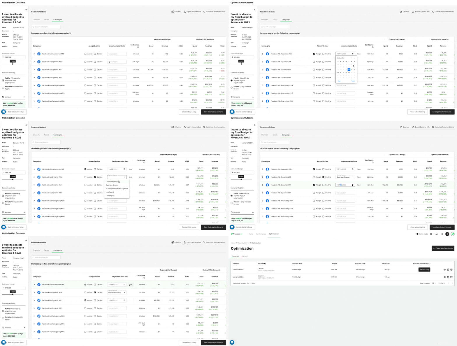
Track the Impact: Once users have reviewed, accepted, and implemented the recommendations, now we know that they want to track the impact of that change! For this part of the workflow, we have added a new tab in the optimization outcome screen called Tracking. This screen will compile only the campaigns that have both been accepted & have an implementation date. We will track the original optimization recommendation to the actual MMM revenue both in-flight and for the total scenario timeframe. In this example below, I have accepted 1 campaign to start tracking today, and one campaign to start tracking on 10/19. Tomorrow, you'll start seeing the MMM Revenue tied to this spend change and track how our forecast stacks up against what really happens.
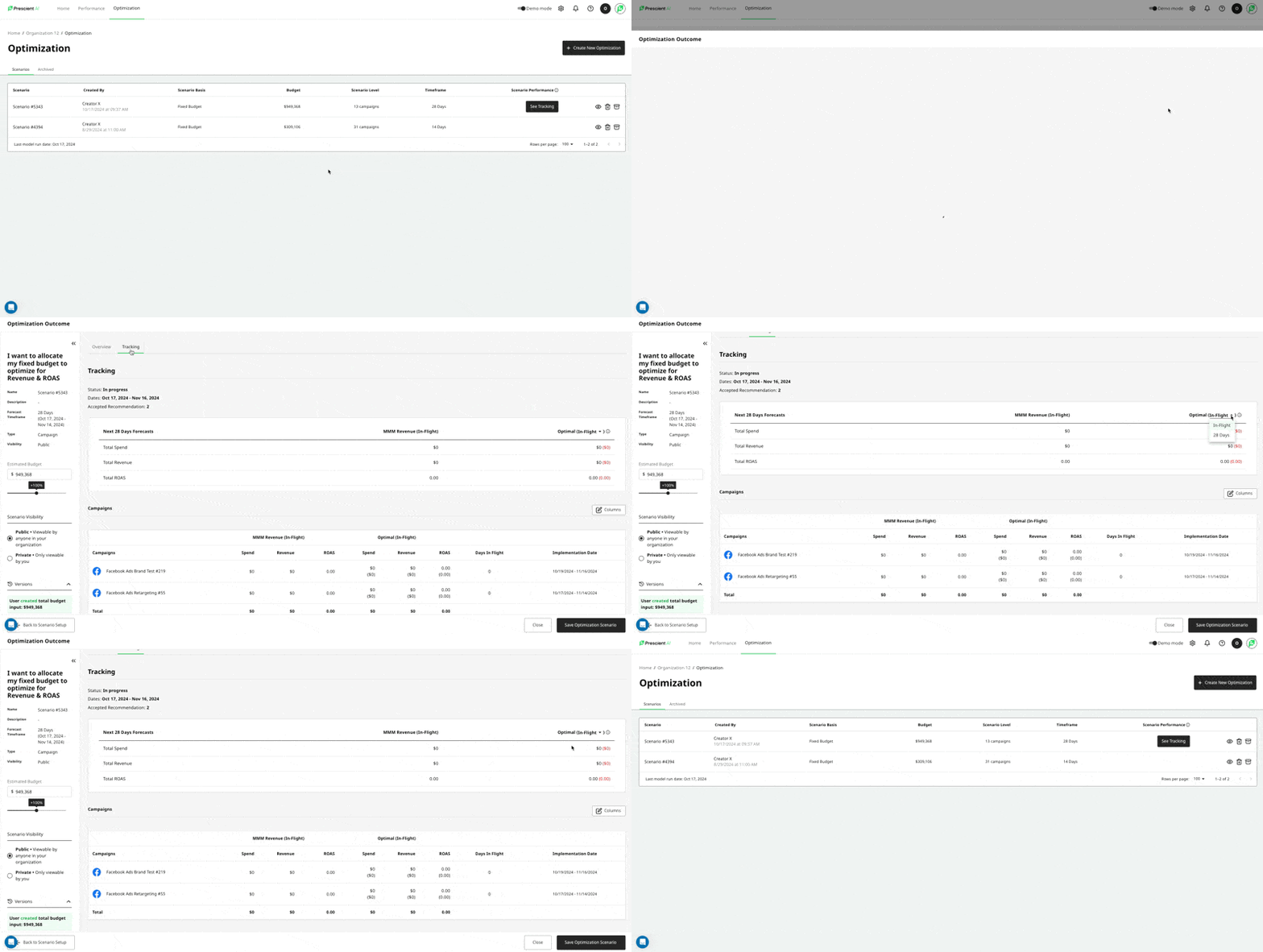
We think this should be a huge improvement to the user experience of using the optimizer and tracking the impact of spend changes on our platform. We are always looking for more feedback, so please share with your CSM!
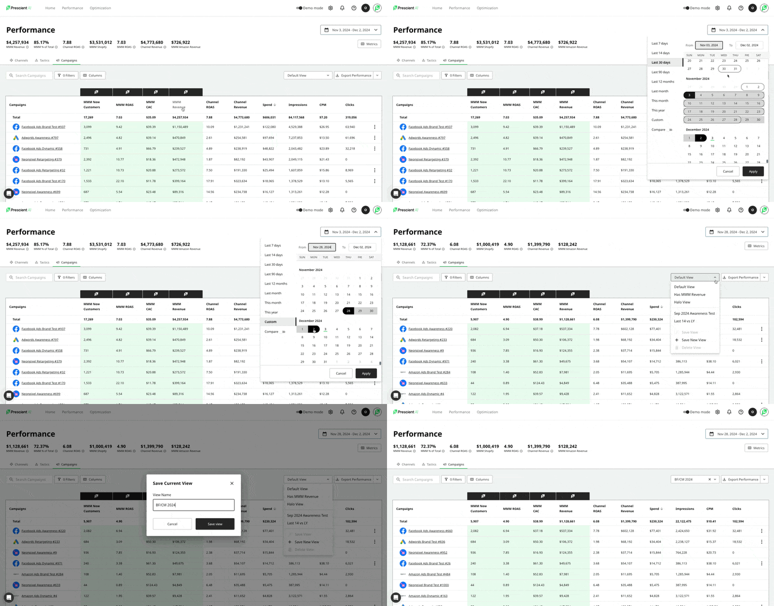
We resolved some bugs and usability issues as it relates to our date selector on the platform:
We are thrilled to introduce our new and improved brand look! With it’s bold colors, geometric patterns, and illuminating colors we know that users will feel more confident than ever and uncover important information faster than before.

We know how important it is for marketers to track the proportion of their eCommerce revenue that is coming from Media, known on our platform as MMM % of Total. This metric appears as a hero metric on the Performance Page, but users asked us for the ability to track this metric over time so that they can correlate and dips or spikes to changes in strategy, events, promos, or external factors.
In addition to having MMM % of Total on the Performance Page, we have included it on the KPI card on homepage as a time series chart. Users can plot any date range, compare date ranges, and see the split between Amazon and Shopify as a percent of total ecommerce revenue (if applicable).

Our users asked us for a new way to visualize time series data on the KPI card on the homepage. We answered this demand by adding in the option for a Stacked Area chart, in addition to the classic line time series chart. To toggle on this feature, simply use the View As toggle, and select Stacked.
Here is a sample of the what the stacked area chart looks like: